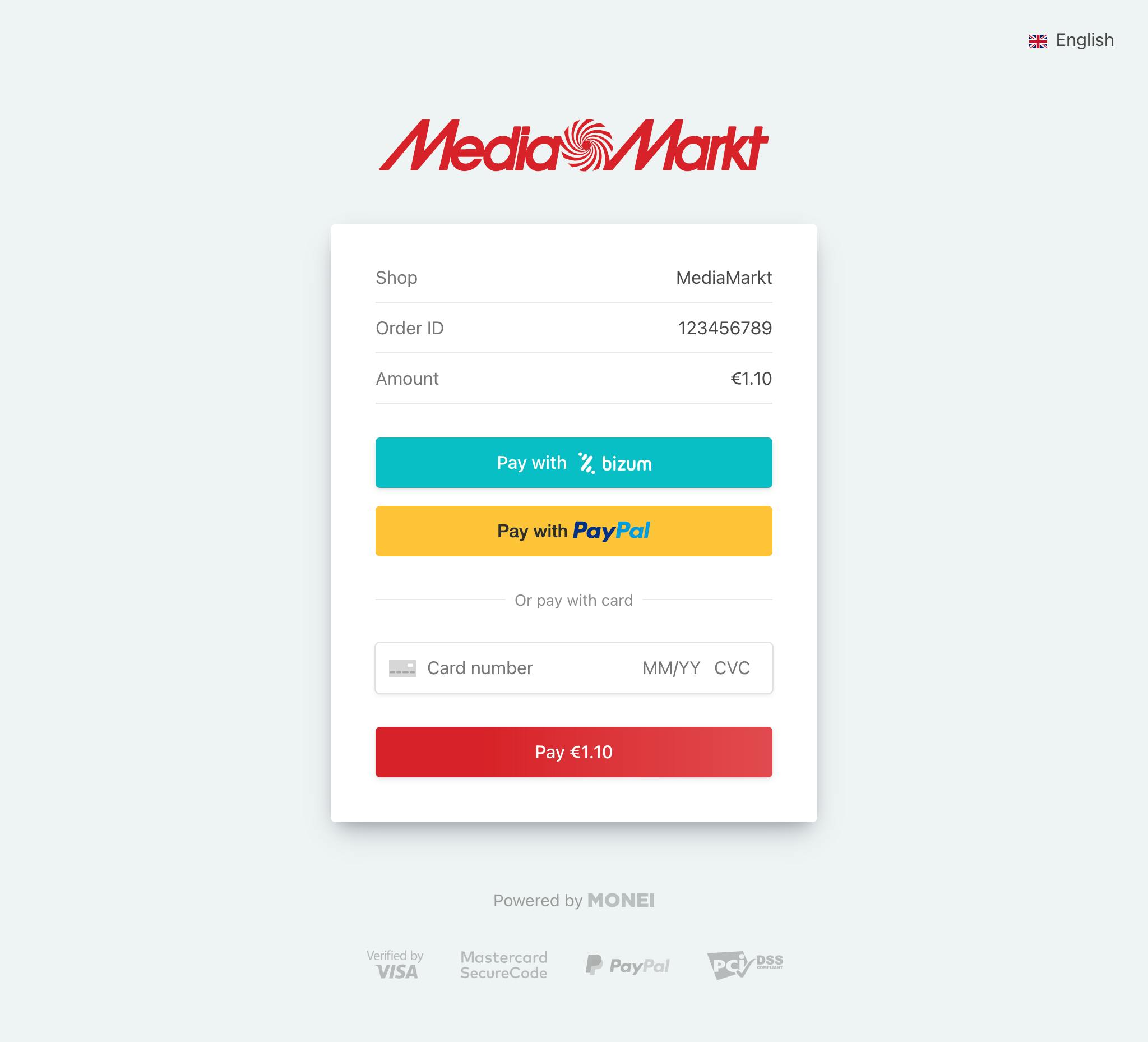
11 E-commerce Checkout Page Tips with Pineapple Development

Image source: Pineapple Development
It’s easy to get distracted and focus on optimizing the front end of your website. Beautiful designs and merchandising products to bring shoppers through your purchase funnel is important.
However, to successfully grow your online store, it’s crucial to have a great e-commerce checkout page.
When it comes to converting shoppers to paying customers, the importance of your checkout page exceeds all aspects of your website.
According to this study from Statista, in March 2020, the online shopping cart abandonment rate in various industries ranged from 67.92% to 96.88%.
That’s a lot of people who almost bought something. It’s also a lot of money left on the table.
You may not know where to start or what features are most important for your e-commerce checkout page.
That’s why we spoke with e-commerce web development expert and Co-founder of Pineapple Development, Donny Minchillo.
Donny shares his tips to help you understand the importance of various checkout page functions. And how you can optimize your checkout page to increase conversion rates.
Let’s dive in.
E-commerce Checkout Page Tips
1. MONEI (M): In an ideal scenario, what steps should get included in an e-commerce checkout flow? In what order should customers have to fill in their information?
Donny Minchillo (DM): The following steps should always get included in the checkout process.
- Customer’s full name, email, and phone number.
- Shipping details, including the apartment number, and a phone number to contact in case the delivery person needs to be in touch with your customer.
- Payment info - It’s a good idea to offer at least two options for payment (more if you can). Nowadays, credit cards are the preferred payment method, but digital payments are always evolving. Many e-commerce sites are currently offering more payment methods including digital wallets like PayPal, Amazon Pay, Apple Pay, and Google Pay. Bitcoin payments are also gaining popularity.
- Many e-commerce merchants miss the opportunity to upsell on the cart page. Having a “related items” section with messaging along the lines of “You might also need…” is a great way to increase your average order value (AOV) when you already have a paying customer’s attention.
Don't include any offers on the checkout page as it could distract your customers from completing their purchase.
Upsell on Cart Page Example
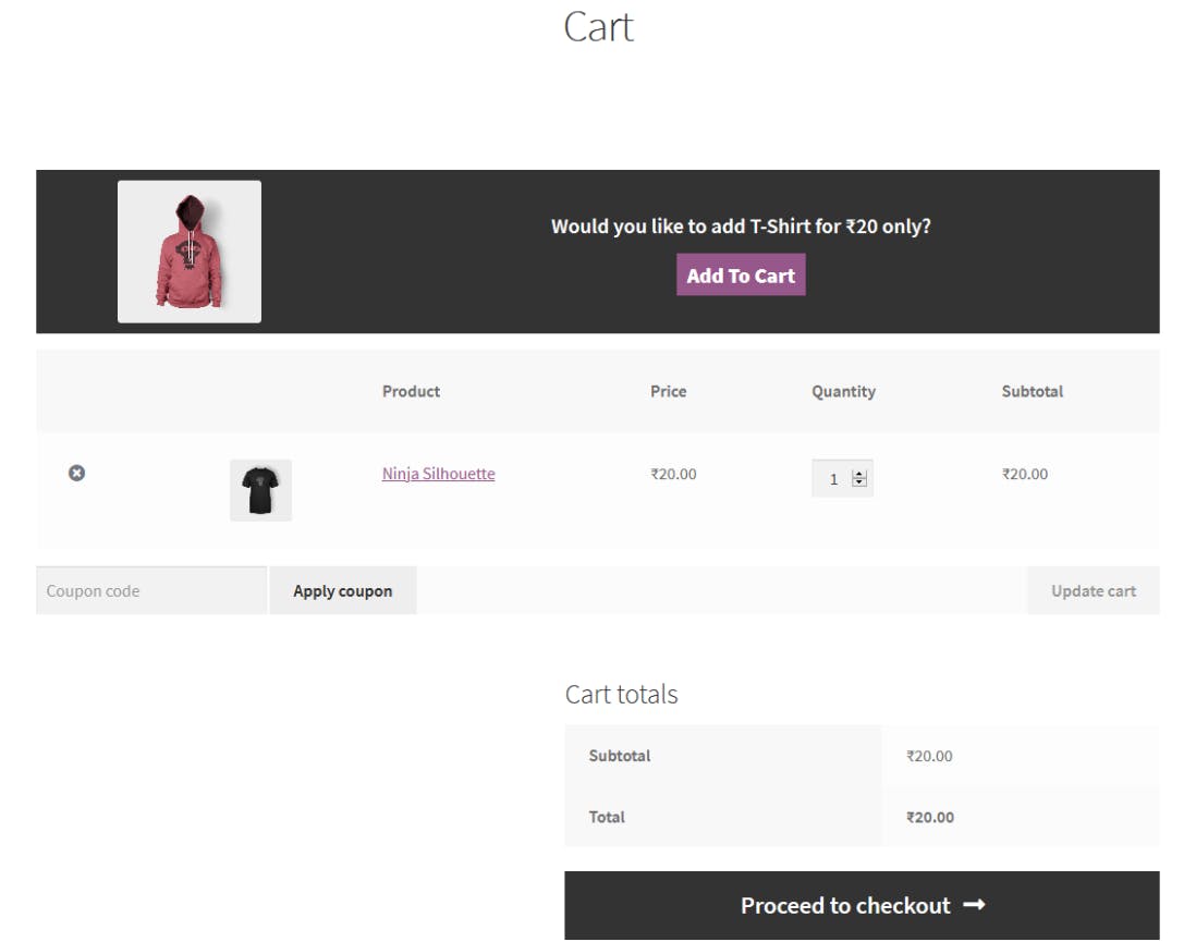
Image source: WooCommerce
Your checkout page should also have links to general terms and conditions about returns, exchanges, and credits. This can be very brief: “30-day money-back guarantee, no questions asked”, “Easy returns. Reach out within 7 business days and we’ll refund in full”, “Return Label included”.
All of these can be used during the checkout process. But there might be others that apply to your business. Consumers don’t like to feel like they have to search for information, checkout is the place to be transparent and put everything on the table so-to-speak.
2. M: How can e-commerce merchants optimize their checkout experience to increase conversions?
DM: Make your checkout experience as simple and as streamlined as possible. You can look at Amazon and try to emulate what they have as close as possible: save shipping address, save payment info, pay with 1-click, make sure to include important information such as estimated delivery, coupon codes, etc.
Amazon is the e-commerce proof of concept. And any consumer buying something online has undoubtedly ordered from Amazon.
That’s the experience the digital marketplace is most comfortable with and although Amazon can do much of what it does because it is the whale in the e-commerce space, it doesn’t hurt to copy as much as you can while still remaining true to what makes your brand unique.
3. M: What are your top three tips for customizing your checkout page to increase conversion rates?
DM:
- Make sure the user experience is simple and seamless.
- Avoid distractions on the checkout page. This is where you get paid. So don’t give your shoppers any reason to leave.
- Add certificates or credentials that give the buyer peace of mind while they checkout.
Further reading:
- Customize Your E-commerce Checkout Page with MONEI
- What is Checkout? How to Optimize it in Your E-commerce Business
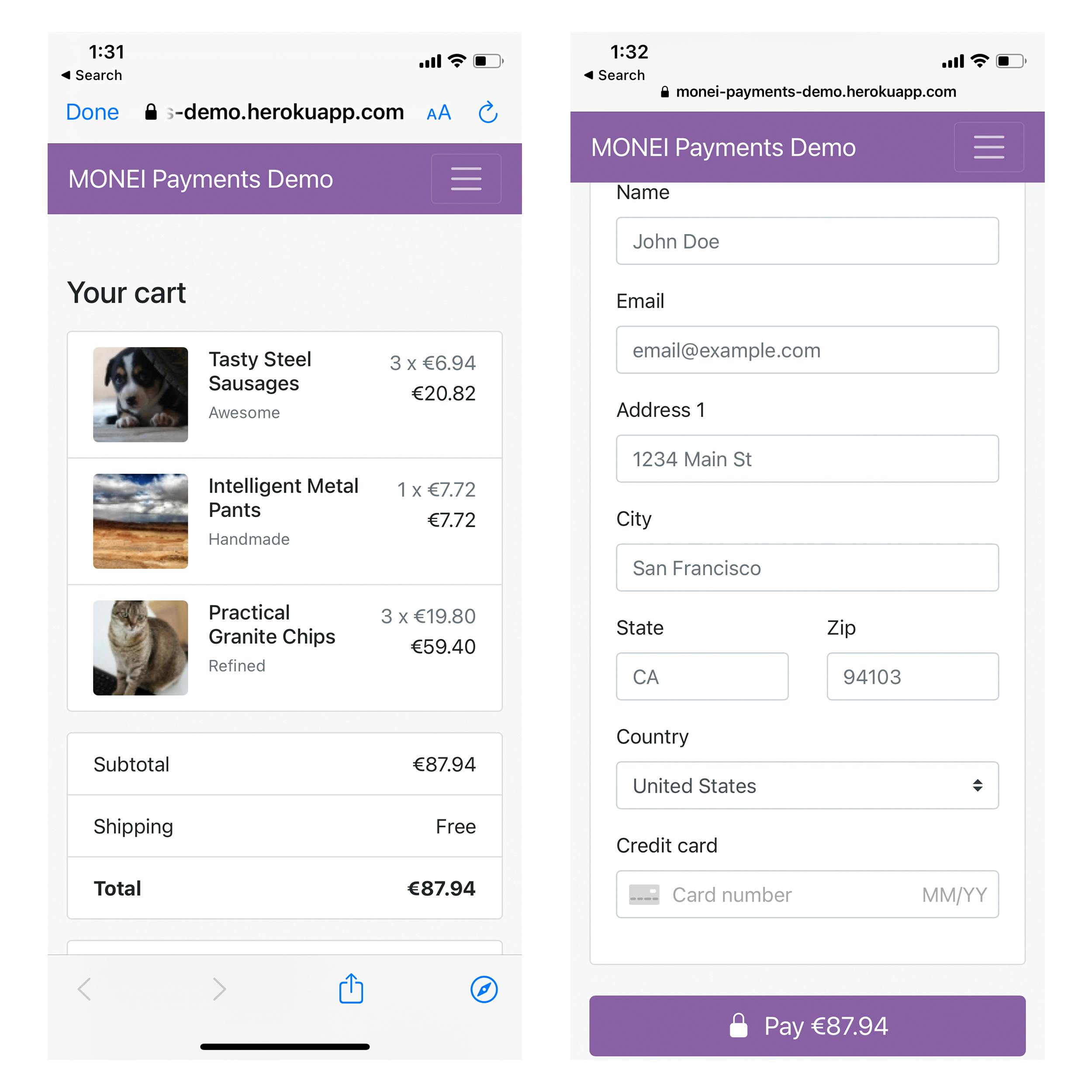
Image source: MONEI Payments Demo
4. M: Do you suggest a mobile-first design for the e-commerce checkout page?
DM: Yes, by 2021 it is expected that more than 50% of e-commerce sales will be mobile — the experience has to be easy, glitch-free, and as quick as possible.
Designing a mobile-first page tends to eliminate issues later on during development that might not have come up if the design began with desktop. The number of variations in mobile design is much greater and that’s why resources should be generously applied to this effort.
This is not to say that your desktop experience is not important. You do still have a subset of consumers whose comfort level is much higher on desktop over mobile and they will ONLY purchase something from their computer.
But again, if you focus first on mobile, the desktop design comes together easier and faster.
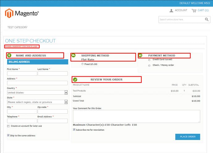
Image source: designsmaz.com
5. M: Is one step (or single page) checkout considered best practice? If so, why?
DM: For the most part, yes! However, some businesses choose not to implement a single page or 1-step checkout due to the fact that it requires the shopper to fill in a lot of information all at once during the checkout process.
Having a step by step checkout process is better suited if you’re collecting a lot of data. Your process from order to fulfillment needs to be well understood to determine your ideal checkout experience.
📚 Further Reading: PrestaShop One Page Checkout: Key Features and Benefits for Your E-commerce Store
6. M: What are your thoughts on one-click checkout?
DM: One-click checkout is the best opportunity to get your customer through checkout quickly without much time for second-guessing.
If the business model allows, you should offer it. But you have to make sure the customer feels good about having their personal information, and credit card data saved for later use.
Cardholders still have concerns about having their personal info saved on someone else’s server. If you’re going for 1-click checkout, the experience from design to flow must be seamless, professional, and flawless.
Amazon can easily get away with this because they’ve gained the trust of millions of consumers around the world, but as a smaller brand, you may have to work harder to gain the same level of trust.
7. M: How many payment methods should e-commerce merchants offer to their customers?
DM: It’s recommended that you offer as many payment options as you can. You just never know which method of payment customers prefer.
You can start with the following payment methods:
- All major credit cards using a trusted payment gateway
- Digital wallets like Paypal, Apple Pay, Amazon Pay, and Google Pay
- By now pay later (BNPL) solutions like AfterPay and Klarna
Once you gather more data about your customer’s preferred payment methods, you can decide which additional options you may need.
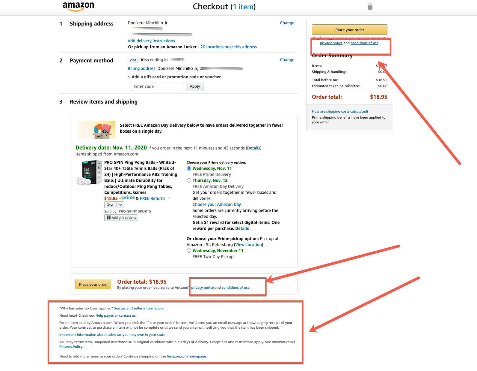
8. M: What can merchants do to make customers feel more secure during their checkout experience?
DM: A few ways to make your customers feel more secure at checkout are to make it easy for buyers to contact support if they have a question. Also, display trust badges and make sure shoppers can easily find your terms, privacy, and returns policy.
9. M: What are absolute no-no’s when it comes to the e-commerce checkout page?
DM: First, be 100% sure that all payment options and every form field throughout the checkout process works! Test! Test! Test! INVEST in QA (for your whole site) particularly for the checkout process. Checkout is the most important part of your website.
Don’t include any additional offers or products on your checkout page.
The customer has already committed to buying something from you and is ready to pay. Adding another option can confuse the customer and might result in cart abandonment. This is ok at the cart page level as mentioned above, but there should be absolutely no distractions on the final checkout page.
10. M: What are the advantages of working with a web development agency to optimize your e-commerce checkout page?
DM: You have the benefit of working with a team who will approach the process from multiple angles; not only technical functionality but also from a design and user experience/flow perspective.
An agency will also typically have far more historical experience than a freelancer. You'll have a team in your corner with first-hand knowledge of what works and what doesn’t, industry trends, and best practices.
11. M: How often should the e-commerce checkout page get tested for optimal performance?
DM: You should test your checkout page 2 - 4 times per year. Once per quarter, or twice per year. And obviously intermittently if you’re receiving customer support feedback from multiple customers eluding to an issue that may be recurring.
Moving Forward with Your E-commerce Checkout Page
Your e-commerce checkout page is the most important element to sustain your online business. If you can’t get shoppers to convert, you won’t be able to grow your business.
Building trust and avoiding small distractions is key to your bottom line. Get feedback from your customers about their checkout experience. Ask what you can improve to reduce friction and provide a better checkout experience.
Focus on streamlining your checkout page and use a mobile-first design. Offer as many payment methods as possible. And do whatever you can to make checkout easy and convenient for your customers.
Additional reading:
- 15 E-commerce Conversion Rate Tips to Help You Sell More
- What is a Payment Gateway? Why You Need One & How it Works
- Customize Your E-commerce Checkout Page with MONEI

Alexis Damen
Alexis Damen is a former Shopify merchant turned content marketer. Here, she breaks down complex topics about payments, e-commerce, and retail to help you succeed (with MONEI as your payments partner, of course).

